The Family Structure
Increasing engagement through UX
Objective: Increase completion of an optional Student Survey through UX and UI redesign.
The Team: Me and a researcher, later joined by 2 other designers.
Company: ETS; Educational Testing Services.
How: User Data Research, Wireframe Design, User Testing, Icon Design, Design System.
The Results: Increased completion of survey to 60%.
Project Overview
The family structure project was created to breathe life and excitement to a family survey that follows assessments administered by ETS to students k-12. This project started with me and a child development expert brainstorming ideas.
We had a few goals for the project:
Create an exciting assessment that would captivate students of all ages
Capture the information
WCAG Compliant
Embrace Diversity
Fun and Engaging
Research Phase
The initial questions were based on years of extensive research and previous family structure surveys.
Initial Design Tests
The original design concept was styled as a children’s drawing. As the student went through the questions they would build up an image representing their family.
The Question Map
This program flow mapped out the question structure. Certain responses changed the potential follow ups. The student could go back at the end to revise answers.
Presenting Two Concepts
Design Test
Once out of the initial UX research phase, we added more team members. A colleague and I designed two different styles for the program and presented low fidelity versions of them to the research and leadership teams. It is important to set expectations when presenting concepts that are not too polished. We needed to express:
These designs are low fidelity wireframes
Fonts, text, and imagery are for placement only
Not Final Look
Content is in development
Design Test Results:
We ultimately decided to move away from the hand drawn look and developed a more modern design.
Designing the Design System
Three of us worked together to develop the various pieces and rules used in the two design options. We created two prototypes in Adobe XD which shared the same pieces, typography, buttons, icons, and design chips.


Design chips were created with many different states.

Final Designs: Option 1
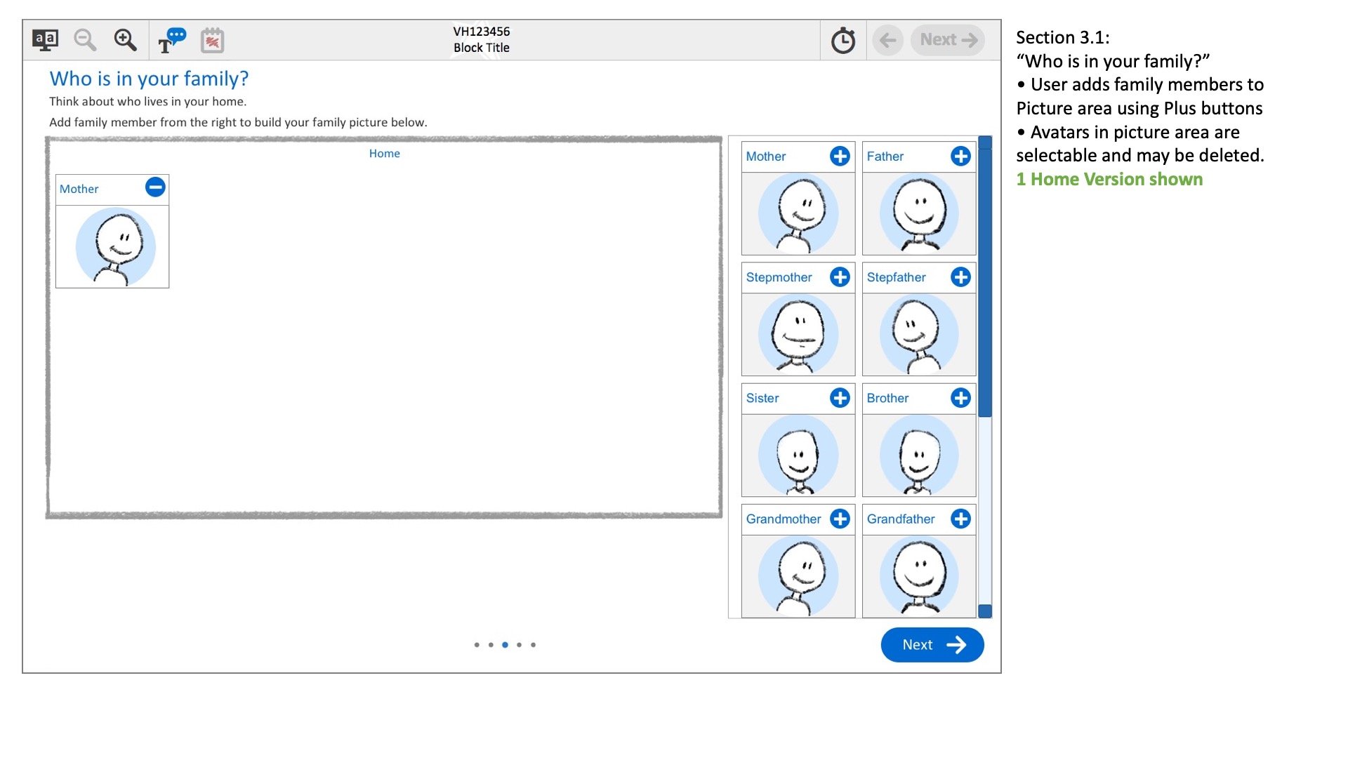
A variety of housing is shown so students feel comfortable with their own diverse circumstances.
Modern Families can live in multiple homes and our program reflects that.
Design chips are created with different characters to show students diversity.
User Experience notes are added for the programmers to reference during development.
Prompts are added to alert students when necessary.
Finally, a summary is shown to students which can be used to navigate back to re-edit completed sections.
Final Designs Option 2
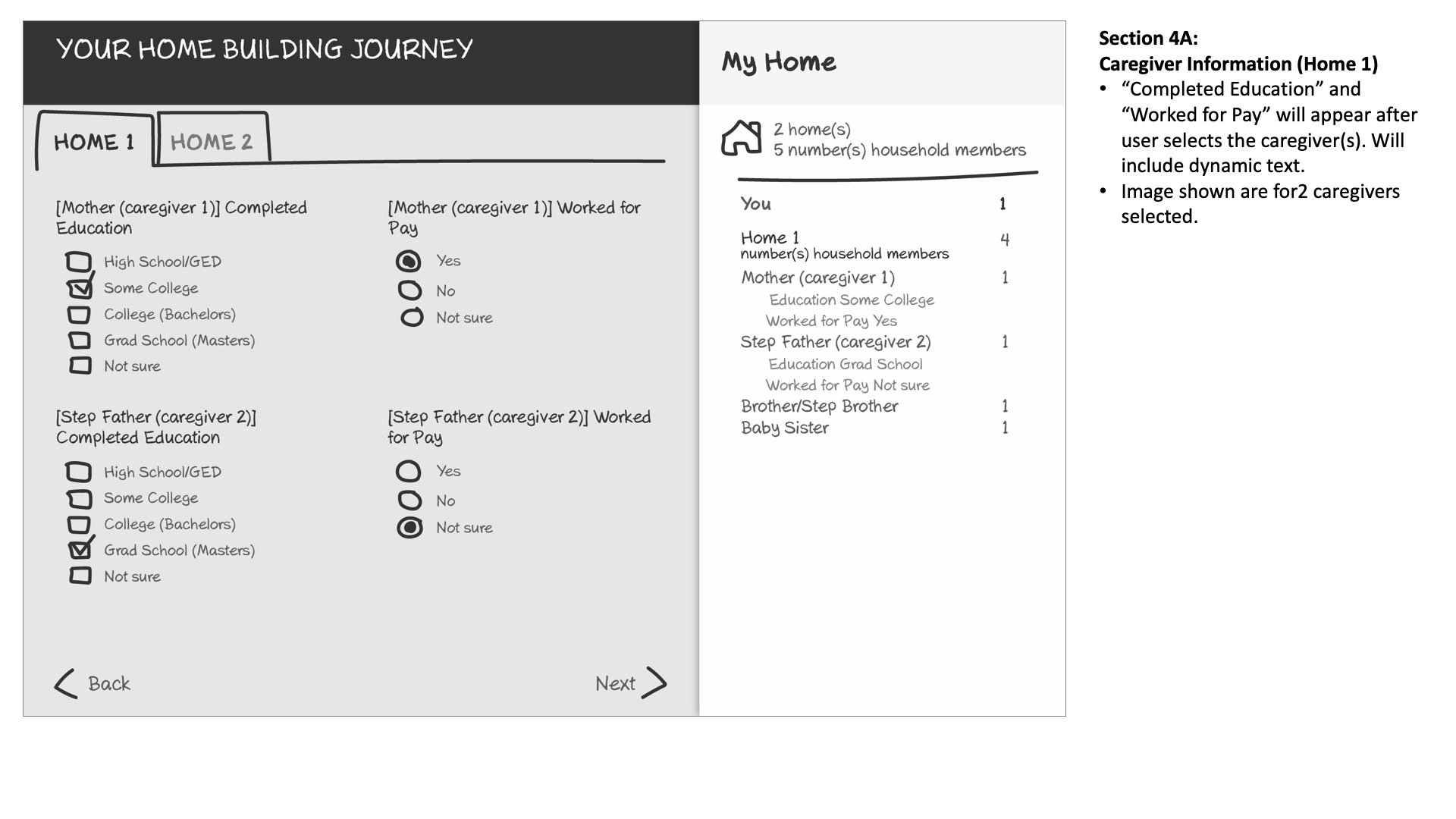
A variety of housing is shown so students feel comfortable with their own diverse circumstances.
This version also asks students about different homes they may live in.
In Option 2, family members are added to the family using drag and drop, for accessibility purposes, this action is also possible using a keyboard.
User Experience notes are added for the programmers to reference during development.
More personalized information is requested at the end of the interactions to avoid student fatigue.
Finally, a summary is shown to students which can be used to navigate back to re-edit completed sections.
Project Results
The family structure project was well received by our federal client. During Cog-lab testing, we saw an increased completion of survey to 60%.
Unfortunately, like a lot of government projects, the Family Structure project is currently on hold.


